MISSSEY, Visual Branding and Website Design
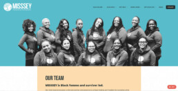
We partnered with Change Consulting on a rebranding and website redesign project for MISSSEY. YolkWorks developed the visual branding, a new logo and designed a new website.
The logo: To symbolize MISSSEY’s role within the community of Oakland, the enduring symbol of an oak tree—including roots and branches—represent networks, community, nurturing, and growth. Just as the roots and branches expand beyond the emblem’s circular frame, MISSSEY’s impact will last beyond any single individual or point in time. On the right is a young Black Femme, the focal point of MISSSEY’s work. She is deeply integrated within the tree because our work is not just for her and about her; as a survivor-led organization, our work IS that young Black Femme.
___
MISSSEY works to prevent girls and gender-expansive youth from ever entering circumstances of sexual exploitation and violence. They also support young people who are experiencing exploitation to exit.
ClientMISSSEYServicesGraphic Design, Website DesignYear2022Linkmisssey.orgFull Res Filebit.ly


